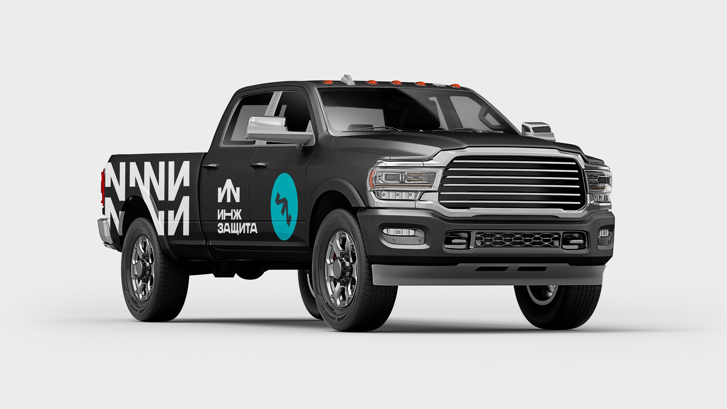
Inzhzashhita
In this project, we built on a very simple idea — lines and geometry. It may seem like nothing could be simpler, but these very elements became the brand’s unique visual code.
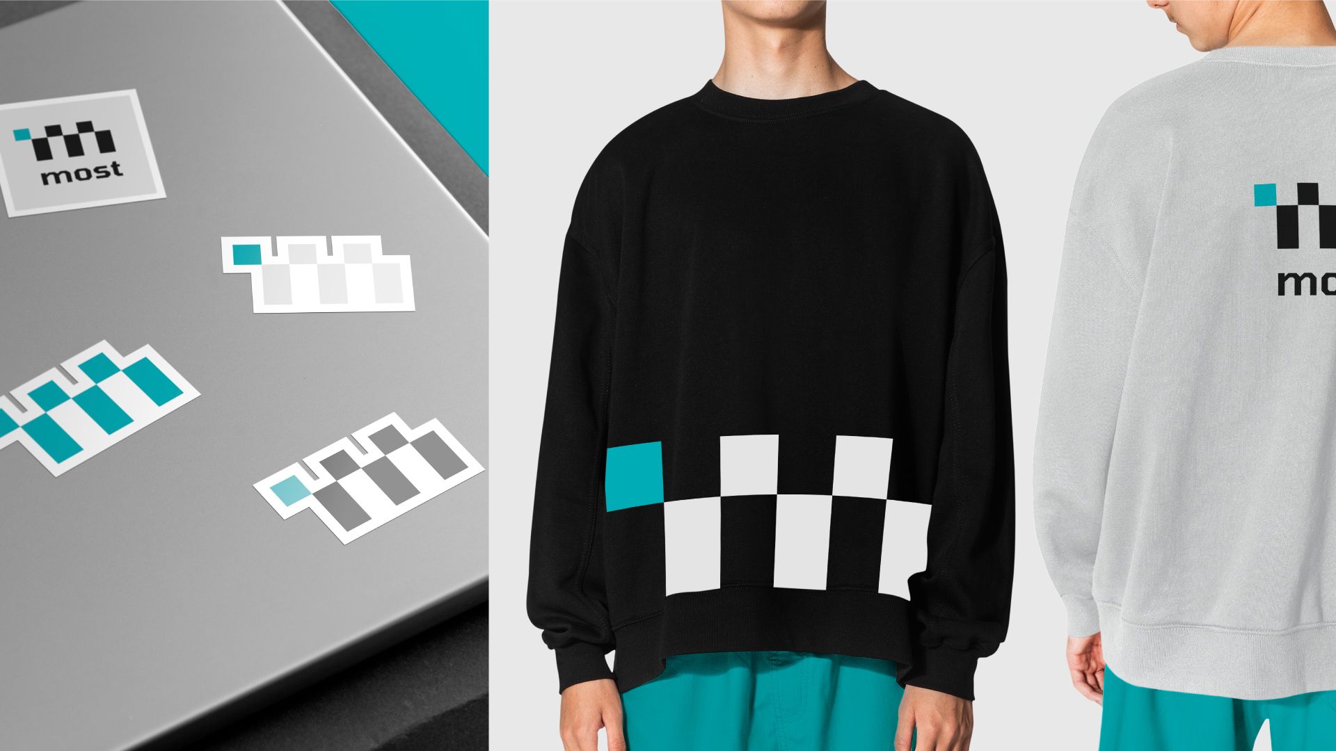
The logo resembles the trace left by machinery — a direct association with the company’s core business.
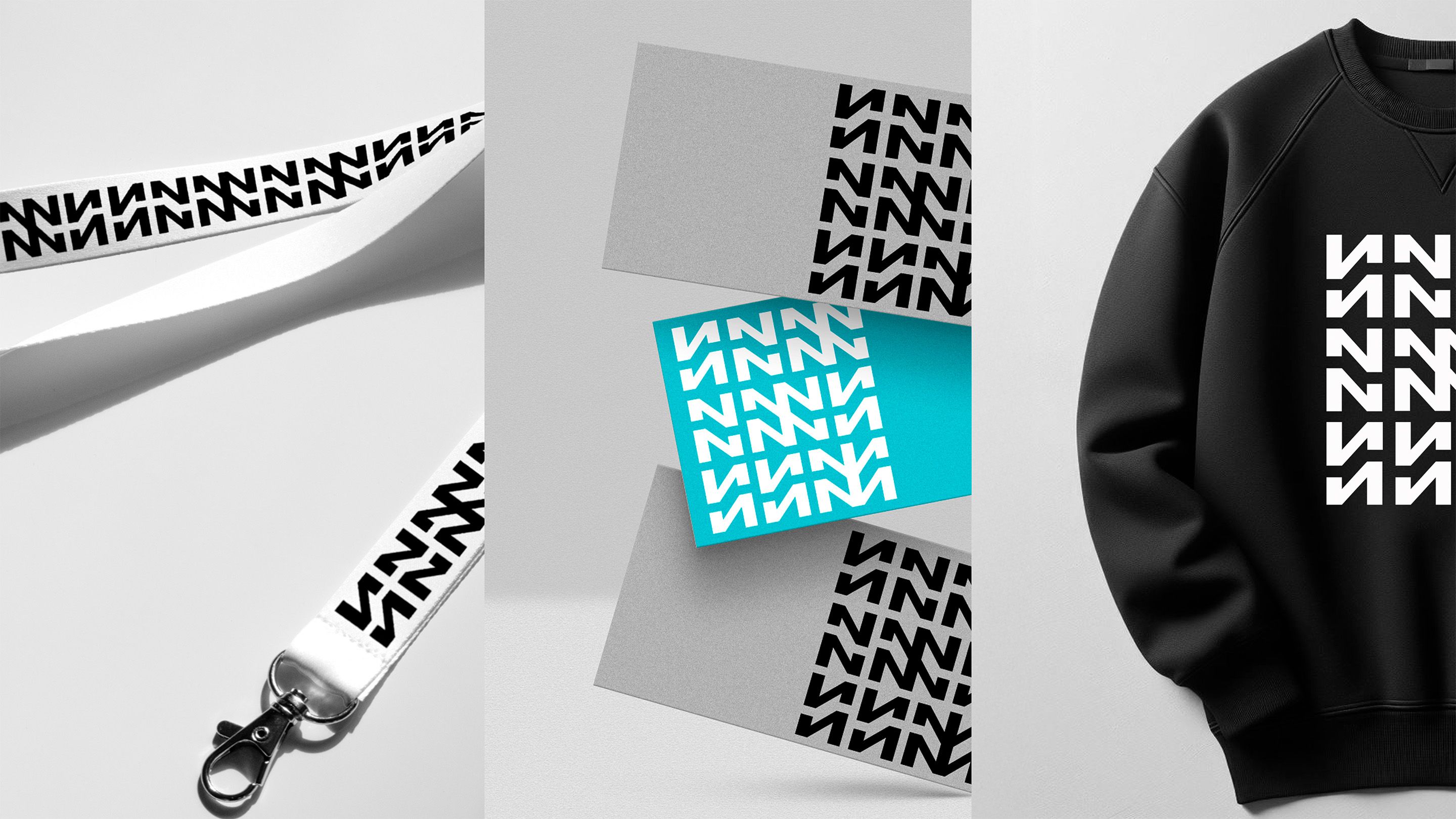
The pattern is not just a decorative element. Its foundation lies in the company’s name, with letters stylized and embedded into a rhythmic geometric design. This way, it functions both as decoration and as a unique “signature” of the brand.
The color scheme is black and white. The monochrome palette emphasizes rigor and technological character, drawing attention to the forms and lines themselves.
This is how we created a system where every detail has meaning. Geometry transforms into the brand’s language: strict, modern, and technological. Together, all the elements form a cohesive and recognizable image of the company.
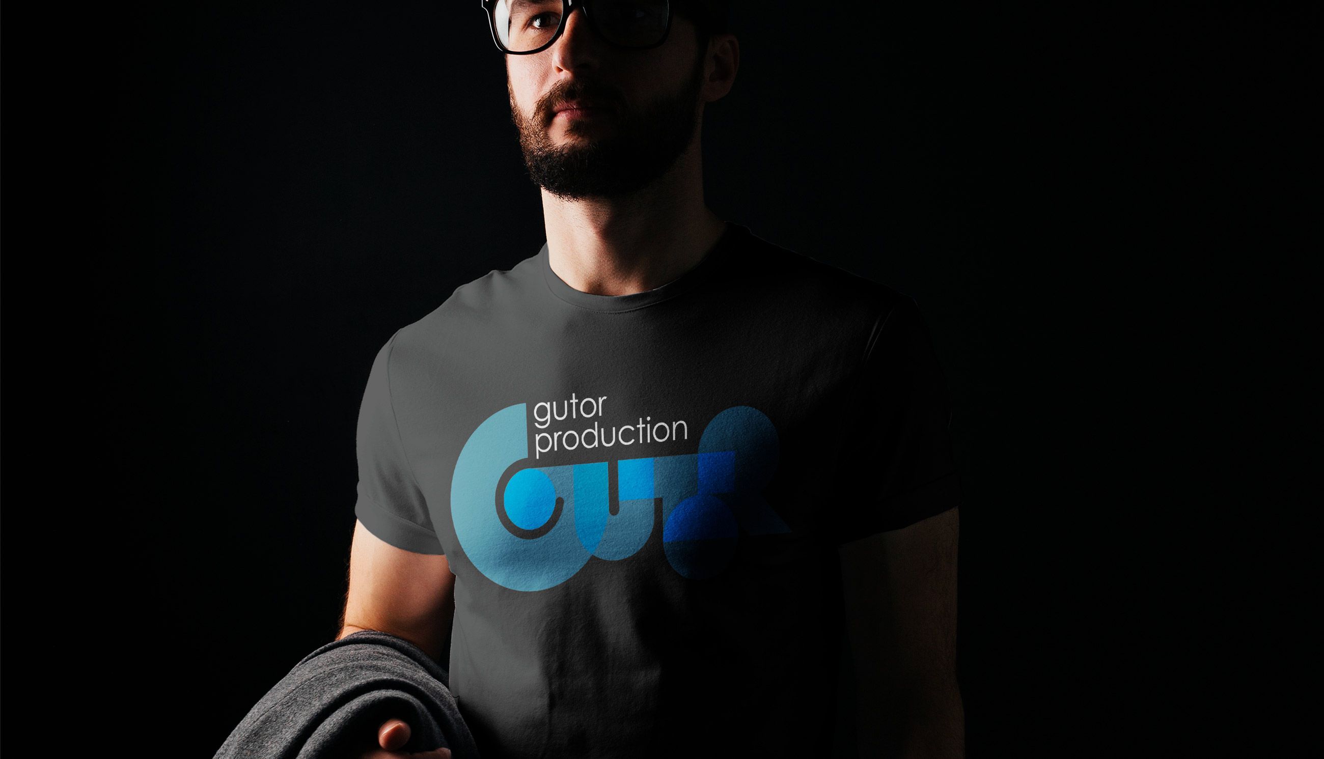
In the brand guidelines, we demonstrated how the visual identity works across merchandise — from apparel to stationery. Even simple items like pencils and T-shirts become brand carriers: strict lines and clear graphics look stylish and modern, even on the most ordinary objects.