In choosing the name 'MOST', we aimed to convey reliability, advanced technology, and superior product quality. The name 'MOST' carries multiple meanings: it translates to 'the most' in English, suggesting superiority, and also connotes reliability, thoroughness, and excellent prospects in Russian. Its brevity, resonance, and vividness make it an ideal choice for effective branding.
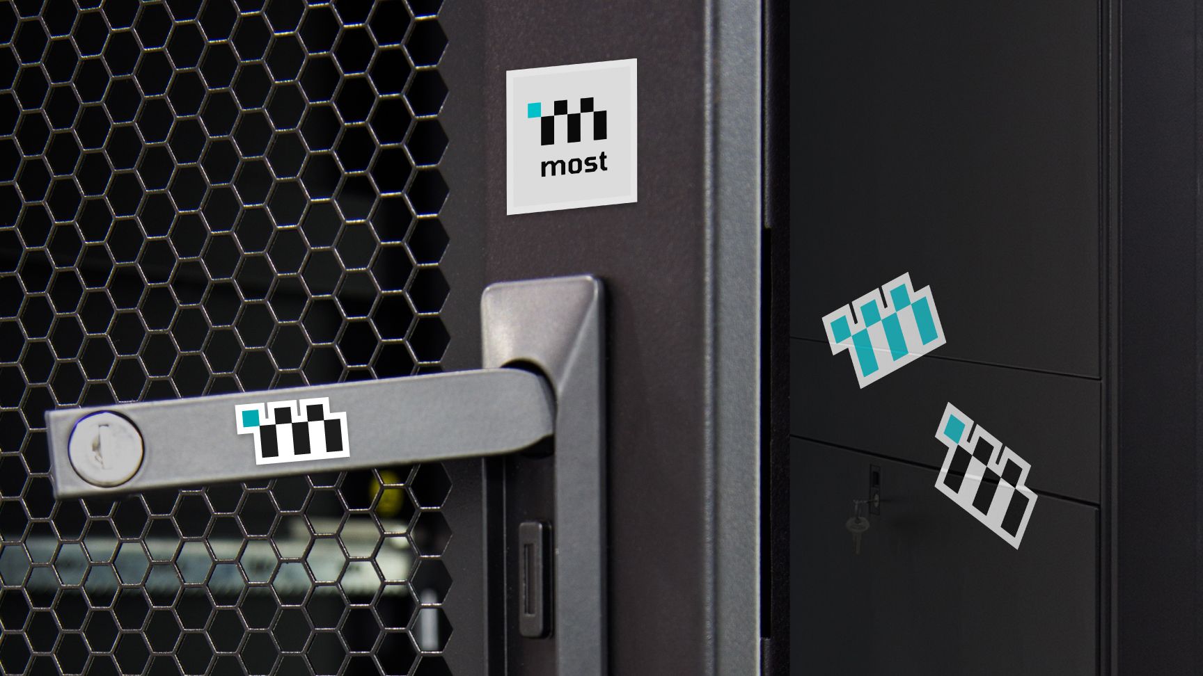
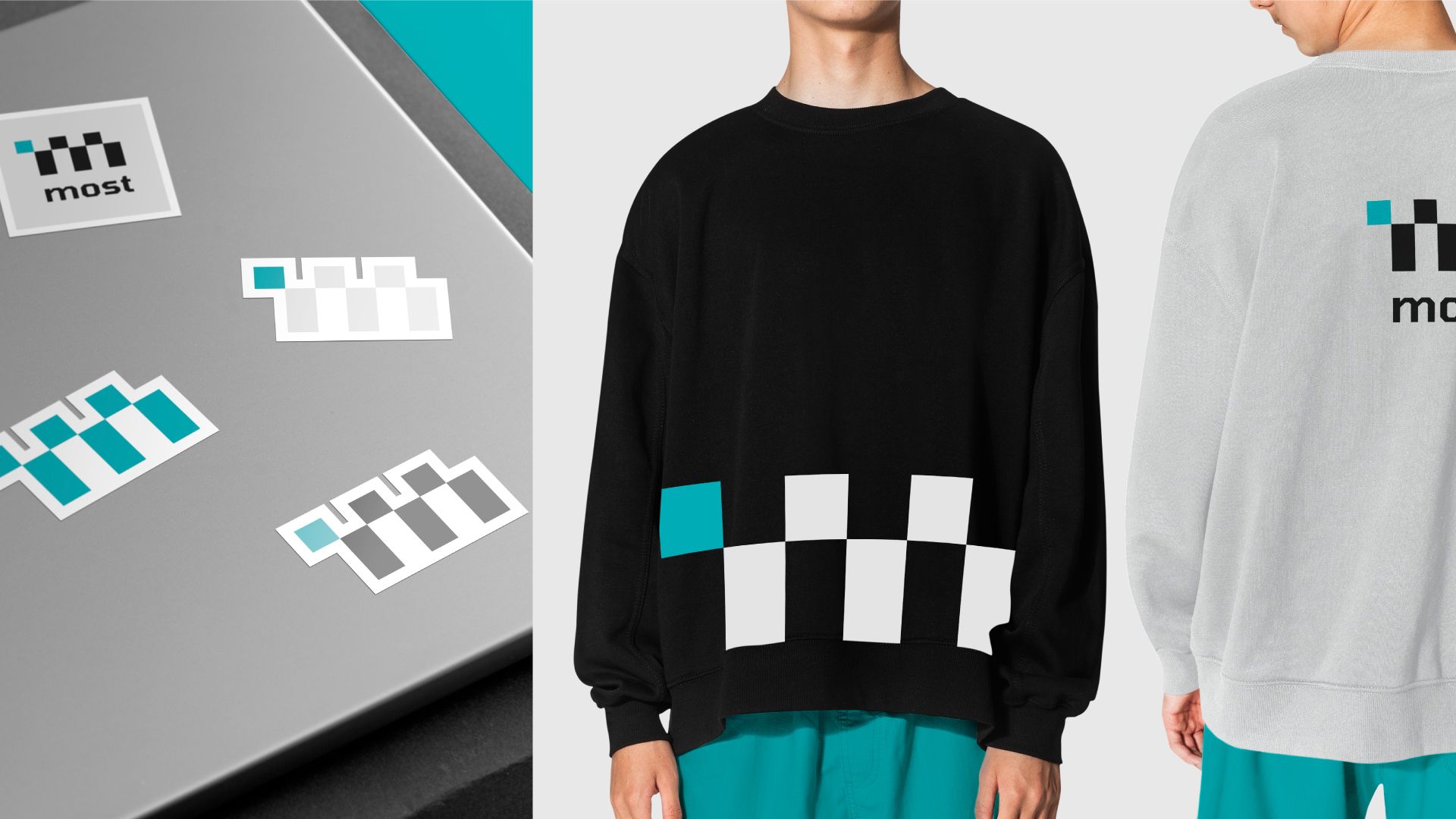
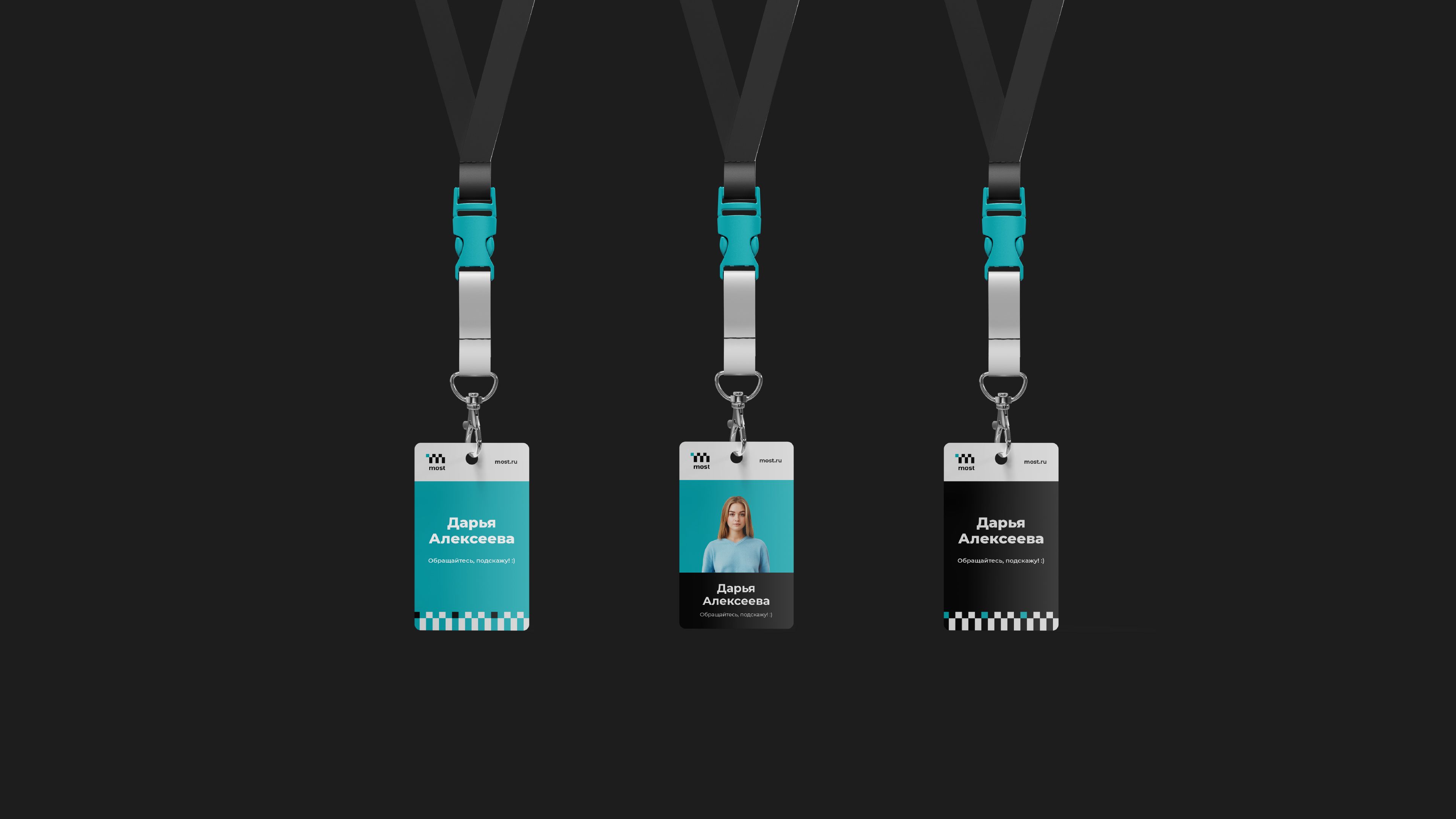
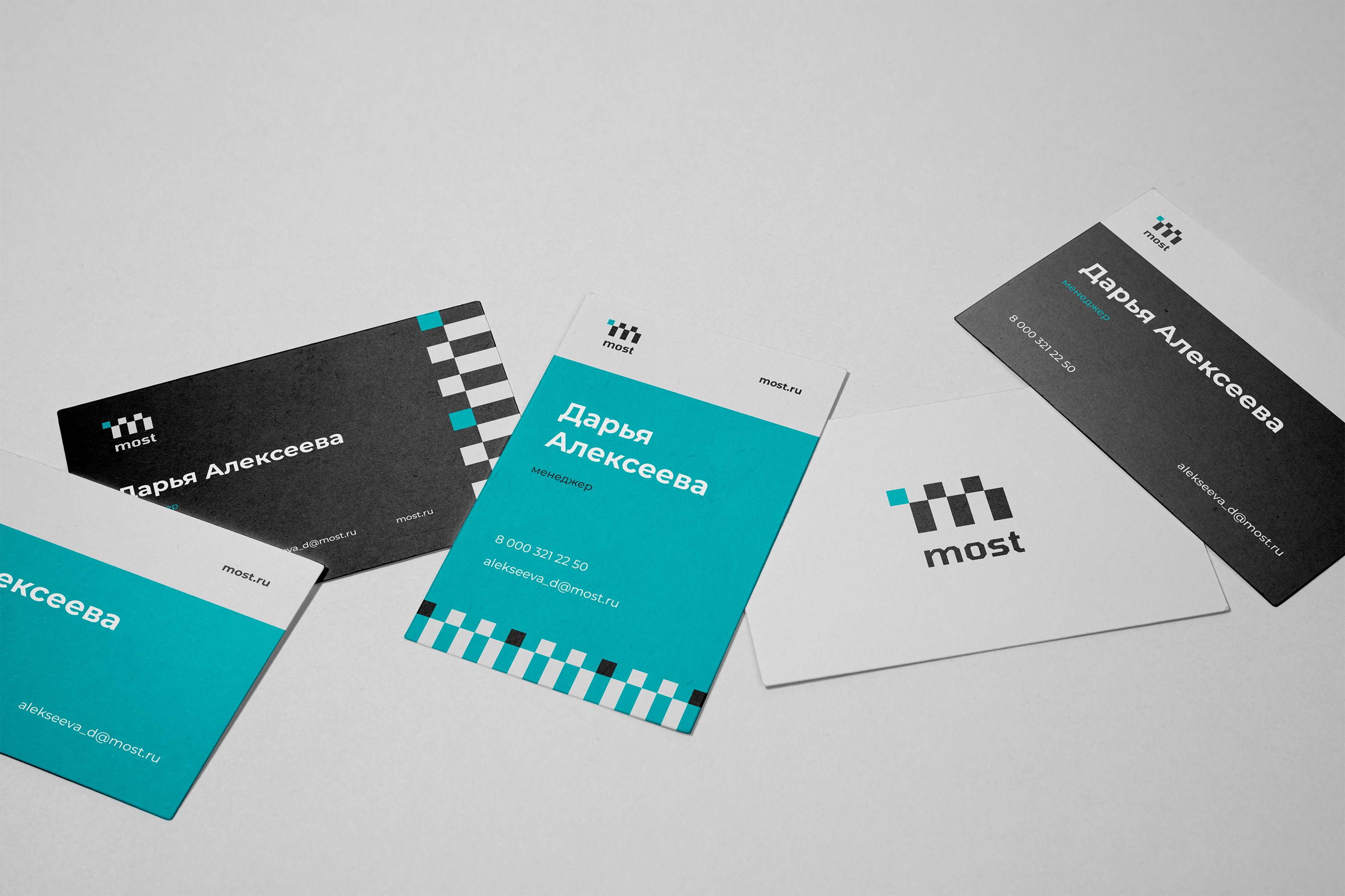
The logo features the letter 'M' in a distinctive shape, composed of brightly colored cubes. This design draws inspiration from pixel graphics, reminiscent of the early days of the information technology era. The logo's simple geometry and vibrant accents form the cornerstone of our corporate identity, making it easily adaptable across various media.