- works
- MacPak
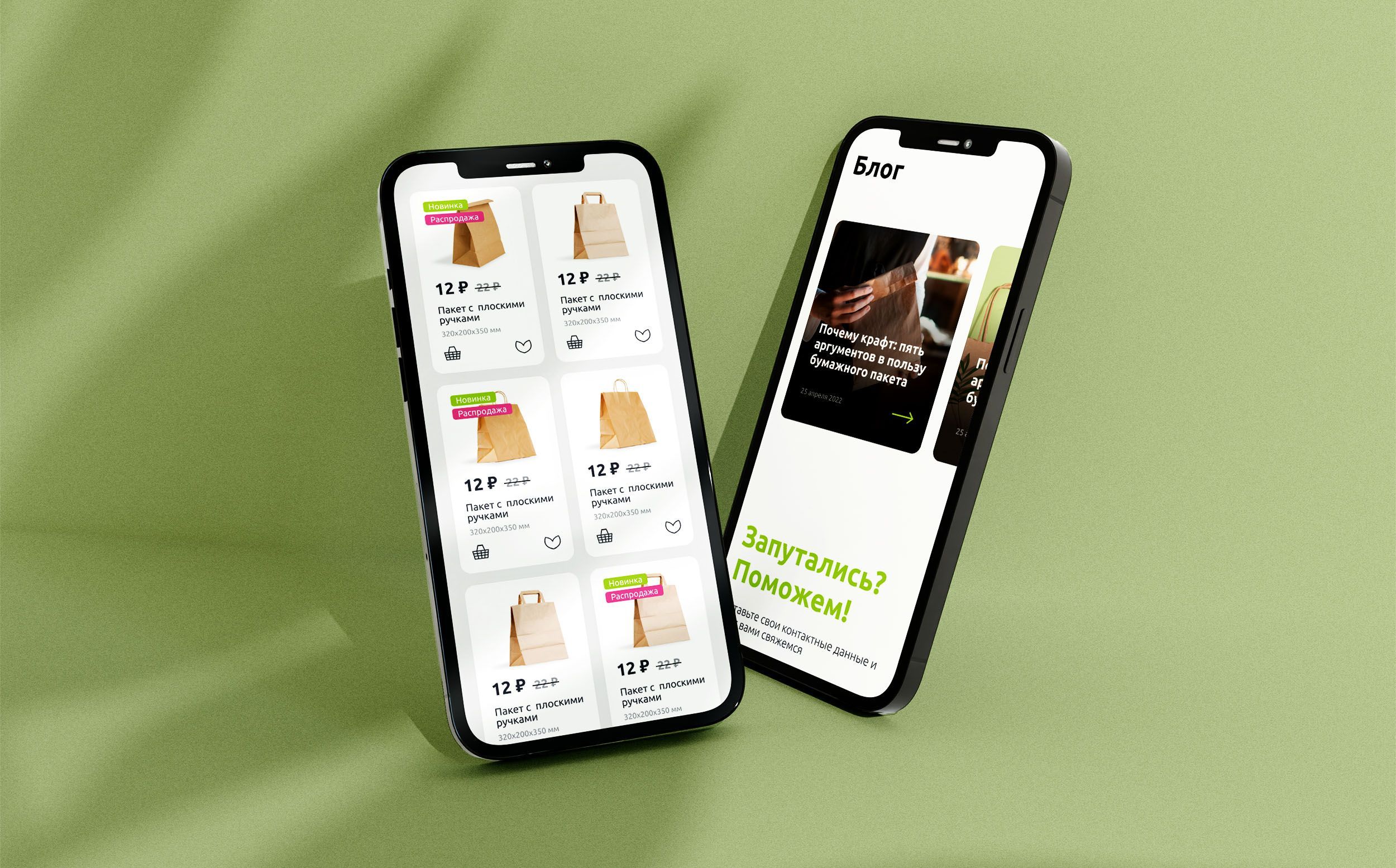
MacPak
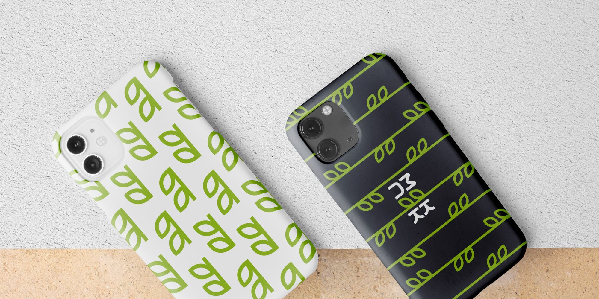
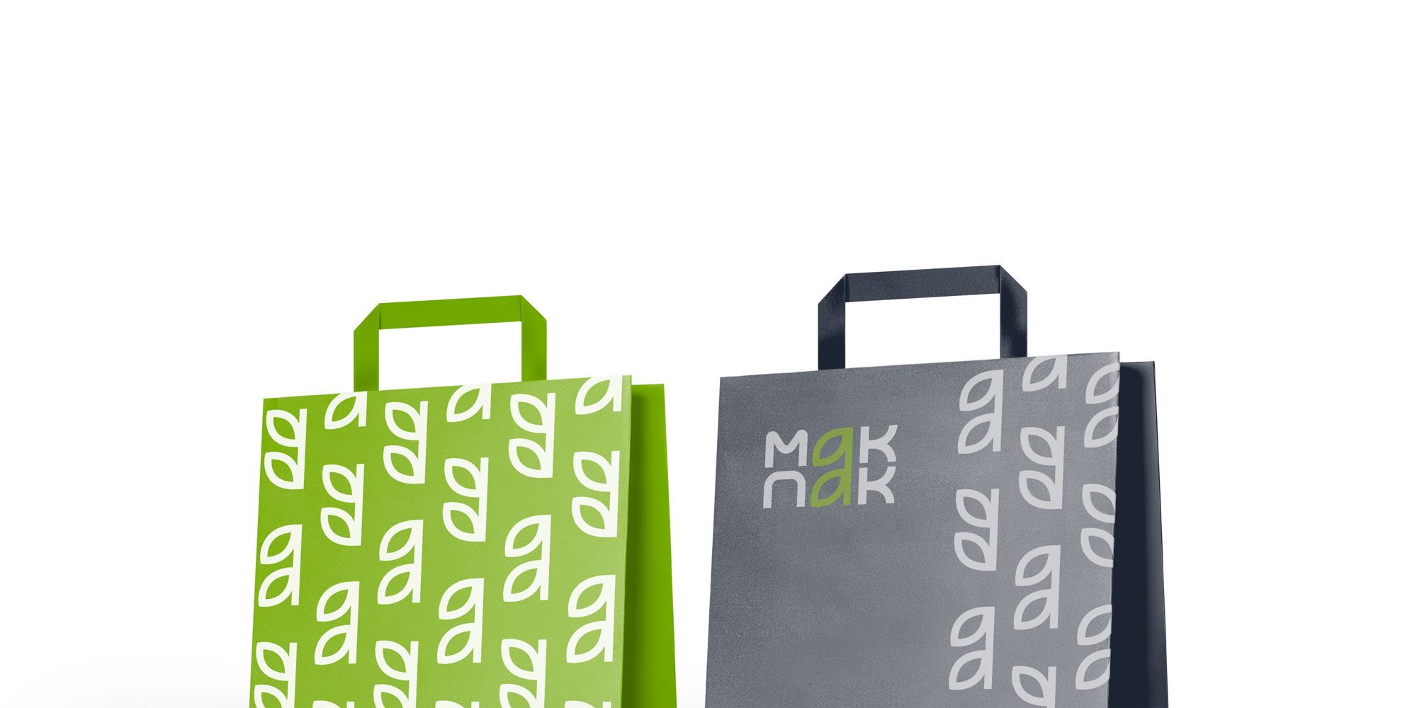
MacPak is a brand whose name reflects the essence of the product: eco-friendly paper bags made from recycled paper. In the process of developing the logo and brand identity, we were guided by principles of eco-friendliness, renewability, and approachability, which are fundamental to the company's philosophy.
Inspired by nature and ecological ideas, we created a logo for MacPak where the letters “a” are elegantly transformed into the shape of a branch with green leaves. This friendly and bright symbol fully reflects the ecological essence of the product, making it recognizable and appealing.
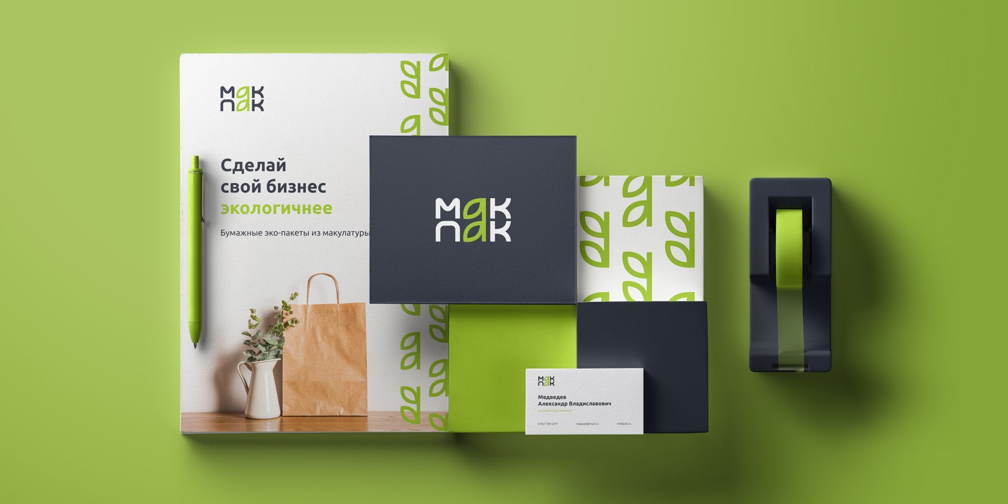
The ecological approach to design takes center stage, highlighting the brand's commitment to sustainable development and care for the environment. Every element of the logo is meticulously thought out to convey the company's core values: respect for nature, use of renewable resources, and minimization of environmental impact.
This approach not only creates a positive image for the company but also inspires other manufacturers to adopt more sustainable and responsible methods of operation. MacPak demonstrates that respect for nature and innovative design can go hand in hand, creating products that are not only beautiful but also beneficial for the planet.