- works
- Uralgazremont
Uralgazremont
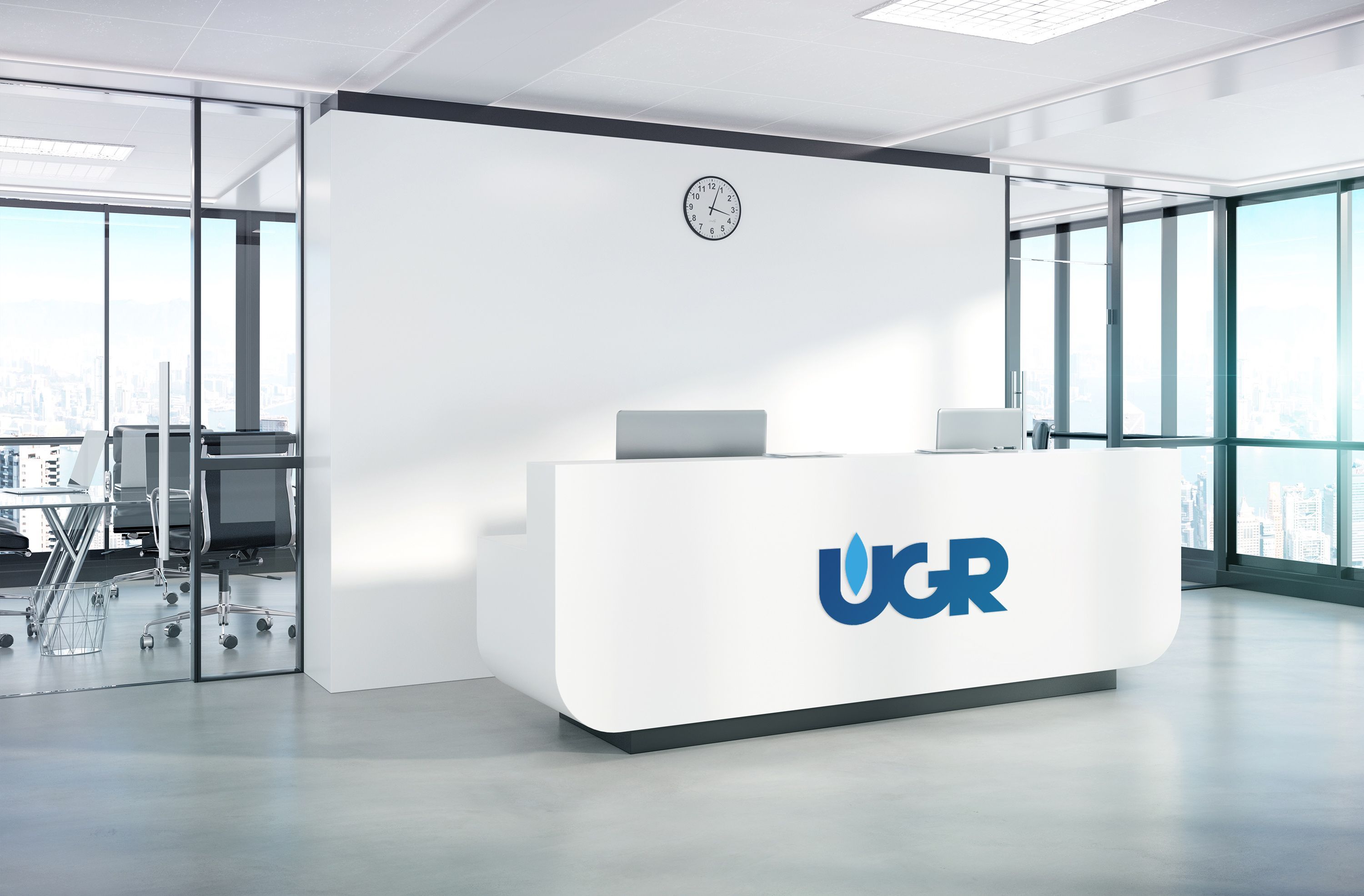
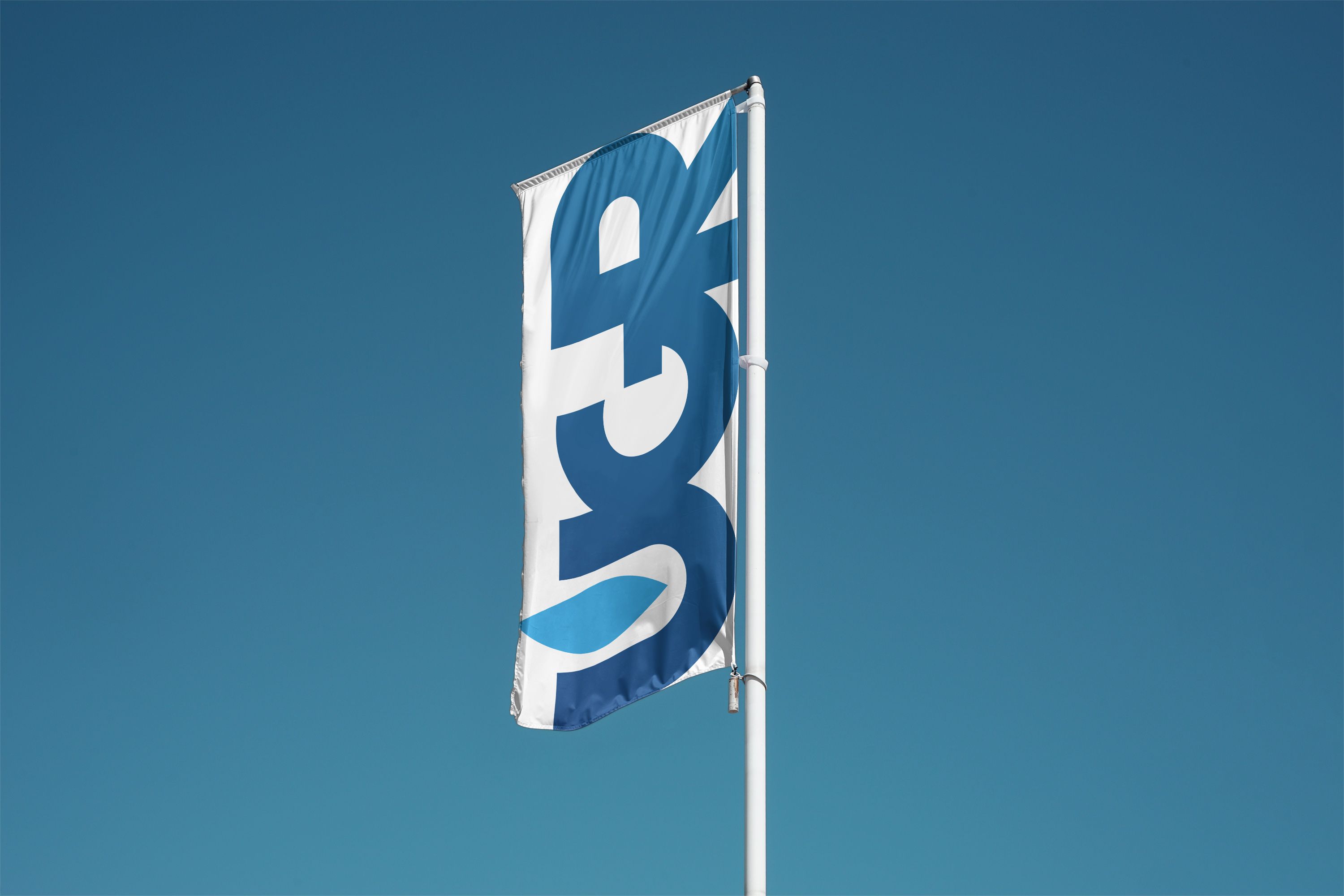
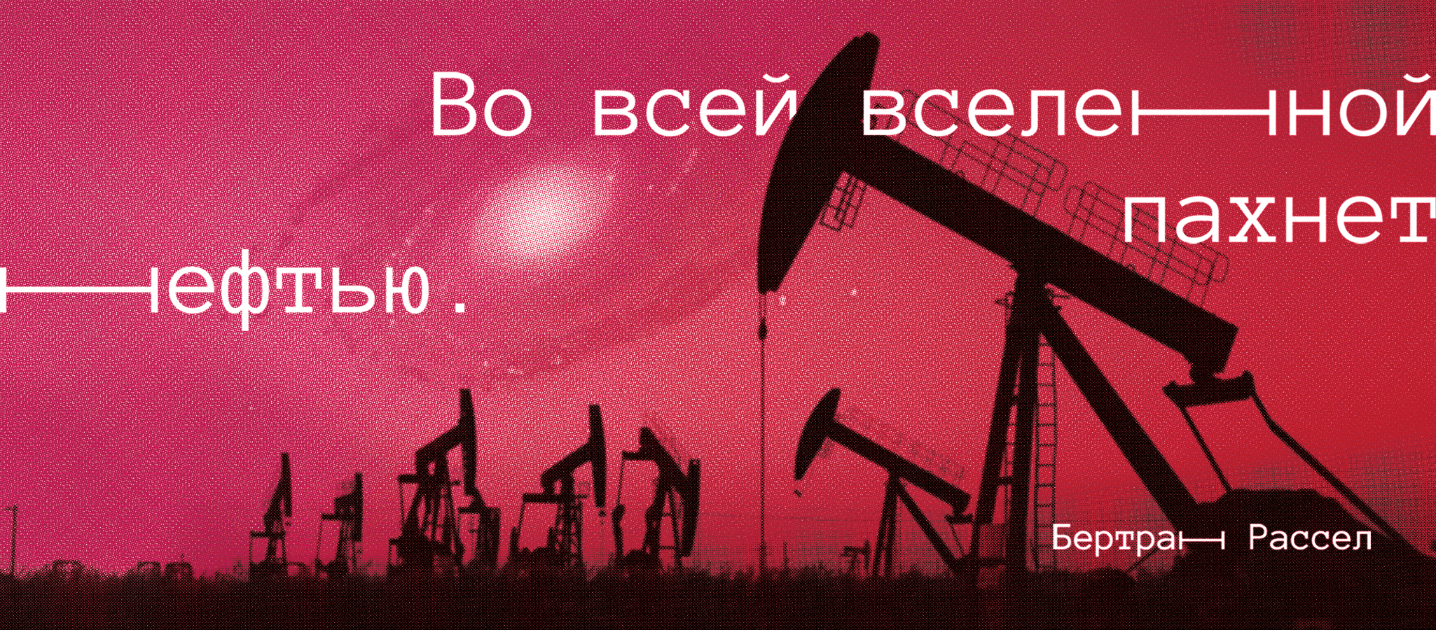
The oil and gas industry is a key business area centered around the extraction and processing of natural resources, known for its high reliability, stability, and prestige. In our new logo, we aim to embody these values.
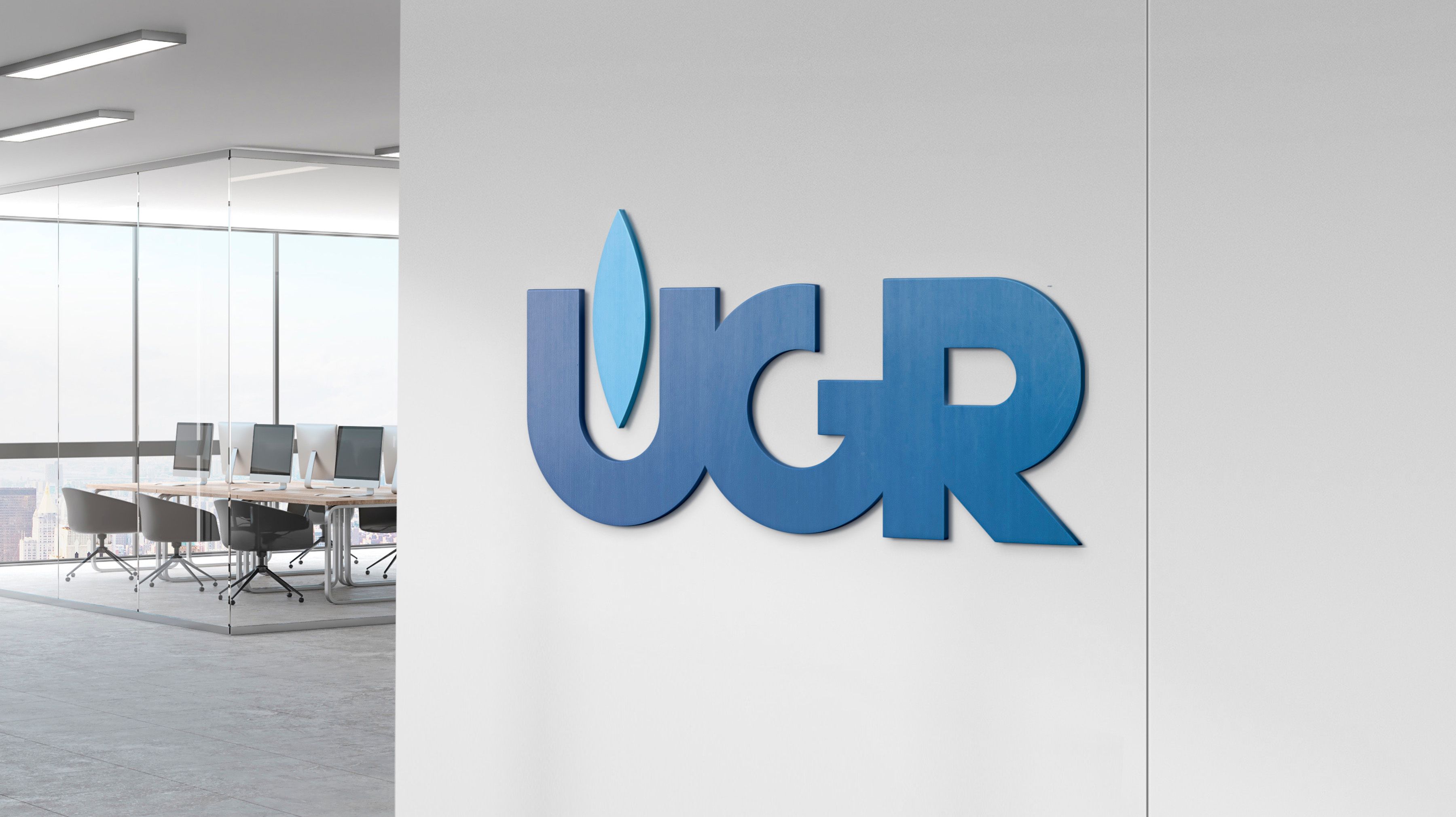
We incorporated the company's abbreviation into a monolithic structure to symbolize reliability and unity. Additionally, the inclusion of a flame image emphasizes the company's direct association with the oil and gas industry, while also representing energy and dynamism.
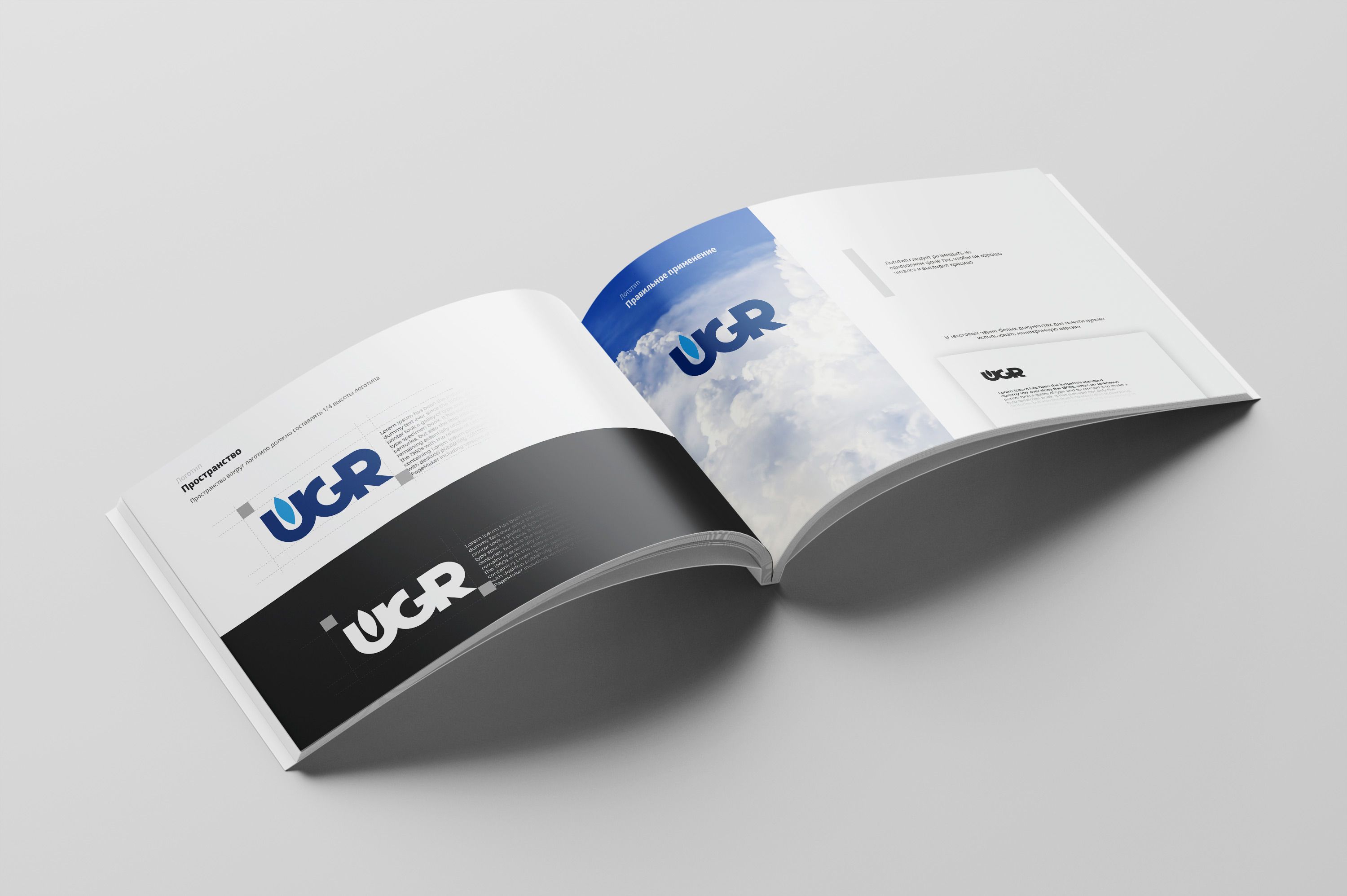
While maintaining familiar corporate colors for customer recognition, the logo of Uralgazremont serves as a symbol of stability, prestige, and its deep connection with the oil and gas industry. This continuity reflects the company's long history of successful activity in the sector.