- works
- Filippov Marketing
Filippov Marketing
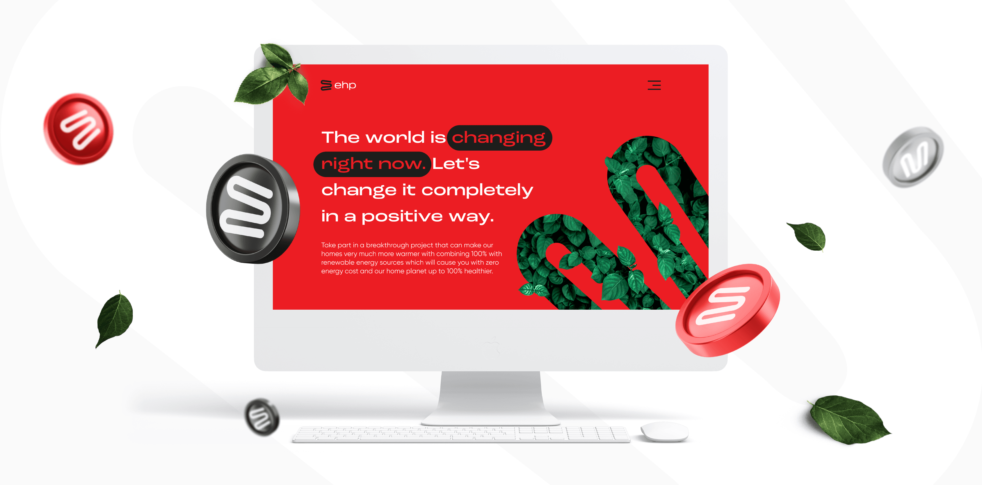
Many consider marketing a blend of science, art, and even sports. Tasked with developing a brand for an 'eco-friendly' marketing agency, we embraced their core values of respect for the company's traditions and a commitment to innovation. The result is Filippov Marketing—a modern, technologically advanced, yet approachable and vibrant brand.
While developing the brand, we opted to simplify the original name of our client's company to enhance clarity without losing its essence. Consequently, 'Ilya Filippov's Marketing Agency' was transformed into 'Filippov Marketing.' The new name maintains its foundational identity while projecting a more modern and dynamic image.

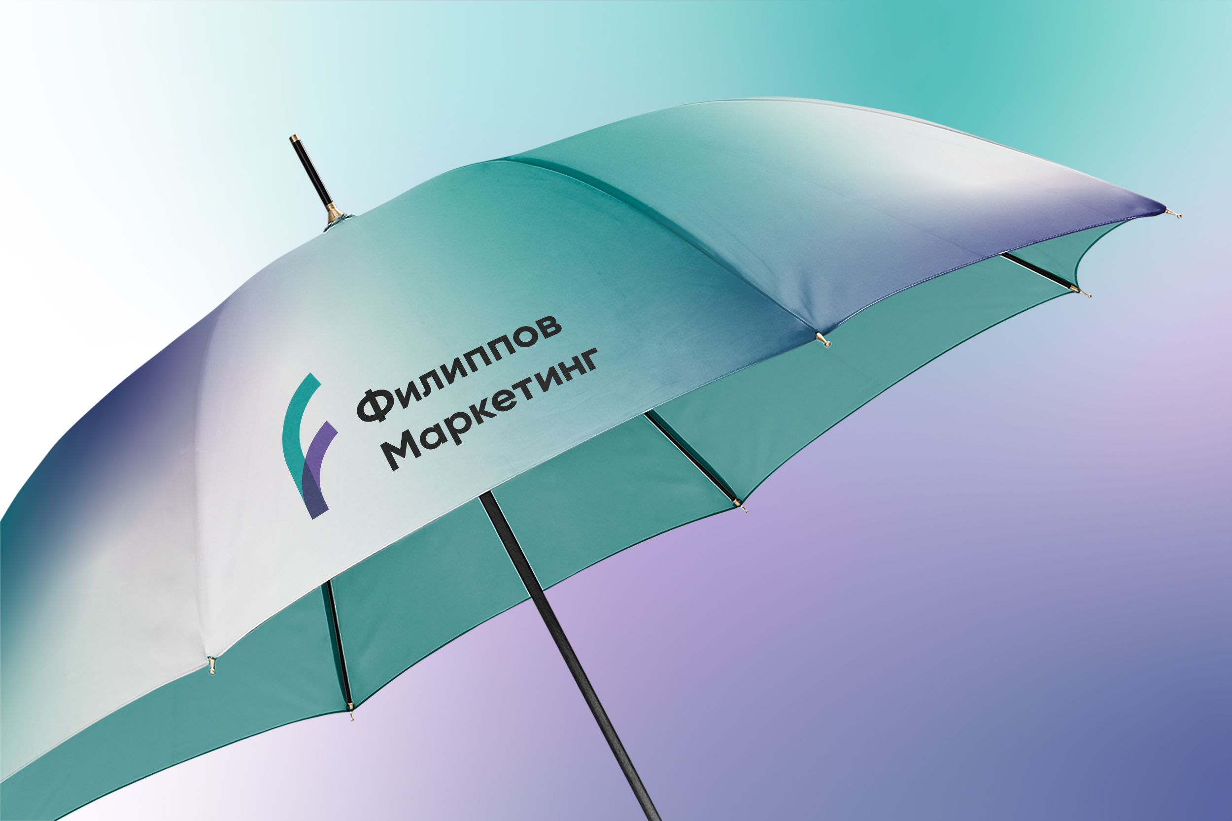
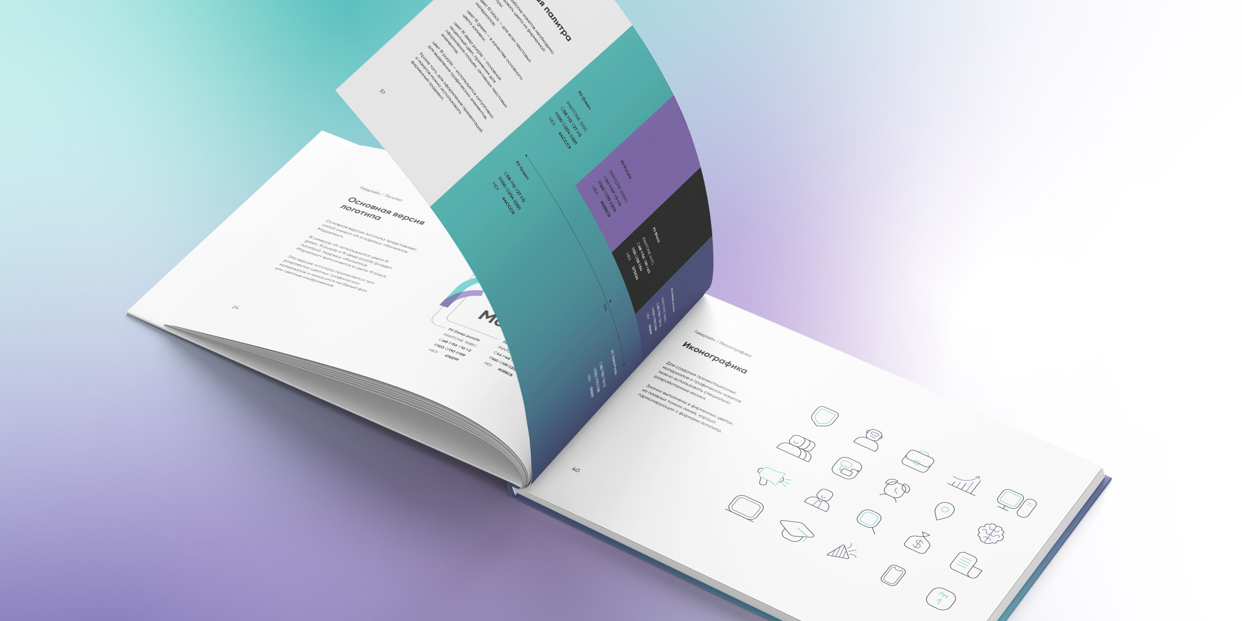
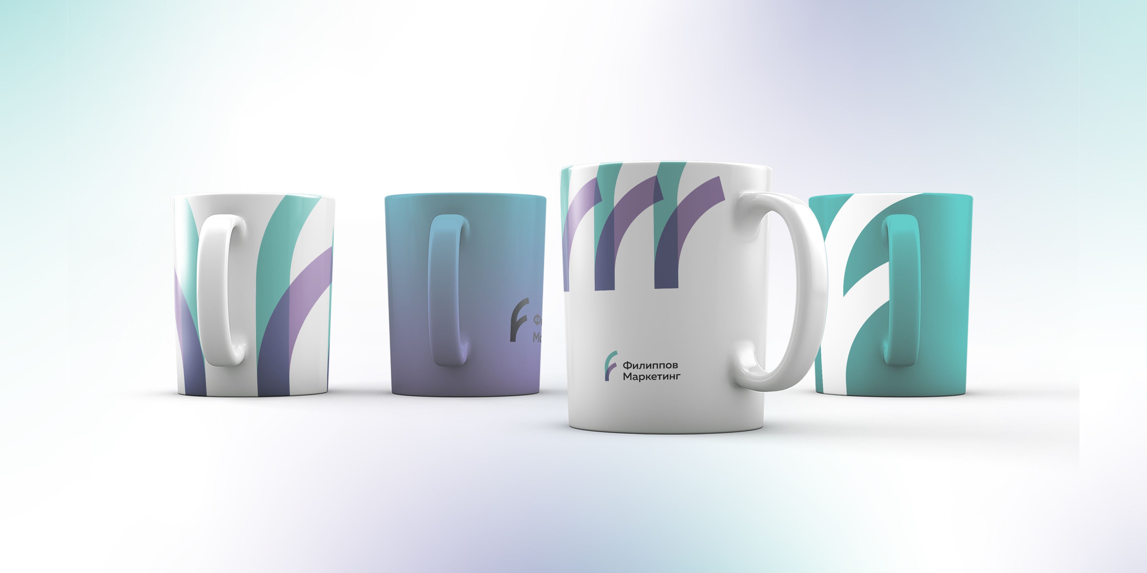
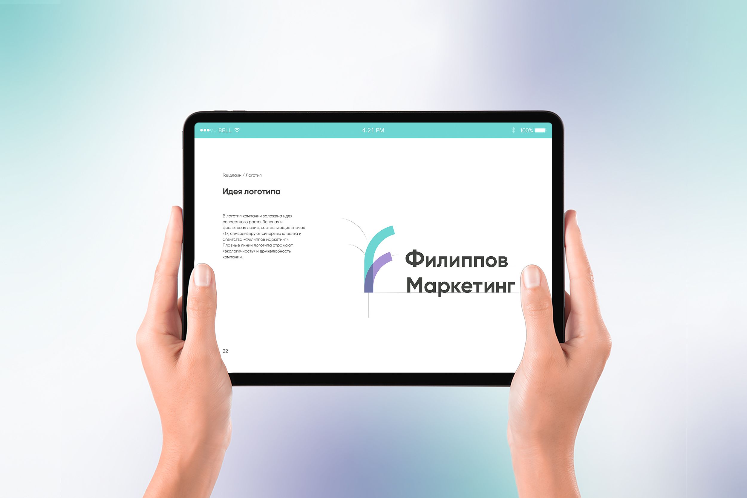
Inspired by environmental principles and the natural world, we designed a logo shaped like the letter 'F', crafted to resemble the branches of a growing tree. The segments of the logo symbolize the mutual growth of the agency and its clients. This design perfectly captures the essence of eco-friendliness and marketing's core goal—pursuing growth..

We have developed a comprehensive brand platform that serves as the foundation for the company's positioning. This platform includes the core values of the brand, defines the target audience, and provides a detailed guide for working with the logo and corporate identity.