- works
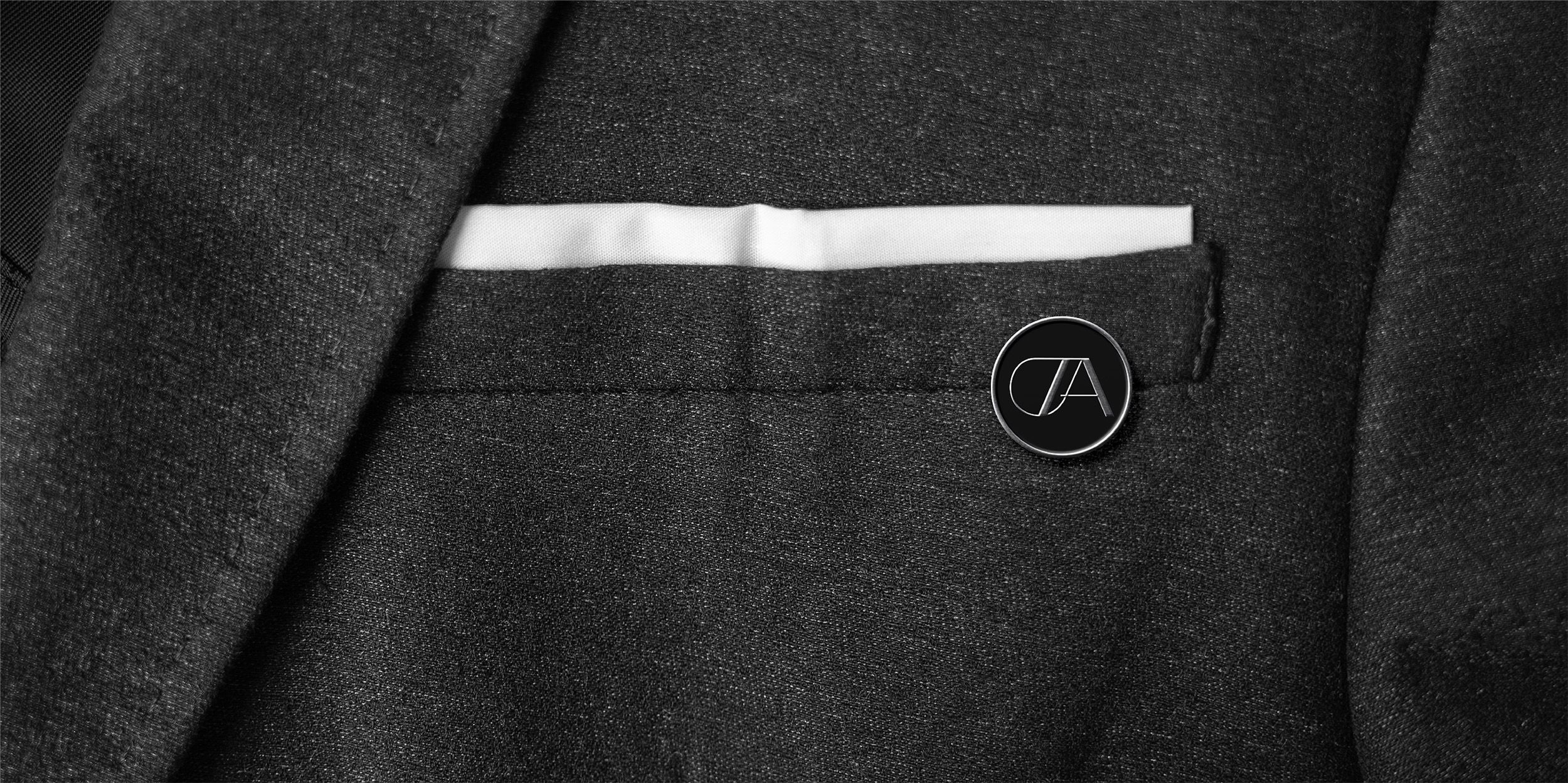
- design TARP Aviation
design TARP Aviation
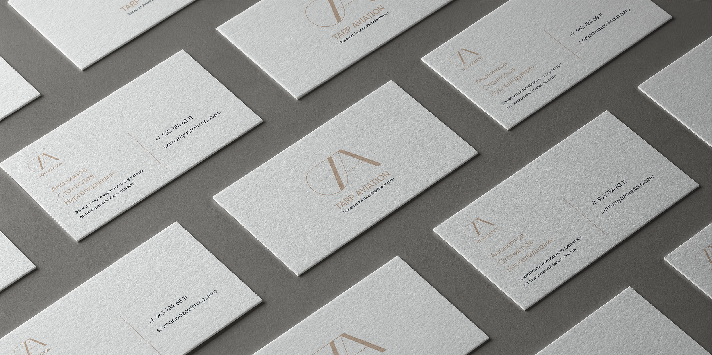
Private aviation embodies comfort, safety, punctuality, and the highest quality of service. The Austrian company TARP Aviation, which stands for 'Transport Aviation Reliable Partner,' commissioned us to develop their logo and brand identity. We drew inspiration from these principles to create a truly premium and stylish brand.

The symbols T and A, derived from the name 'TARP,' are merged to emphasize the unity and reliability of the brand. This design fosters brand awareness and symbolizes strong partnerships within the aviation industry.
The wide elements at the center of the logo are designed to resemble a runway viewed in perspective. This symbolism represents the beginning and end of each flight, highlighting the punctuality and safety for which private aviation is renowned.
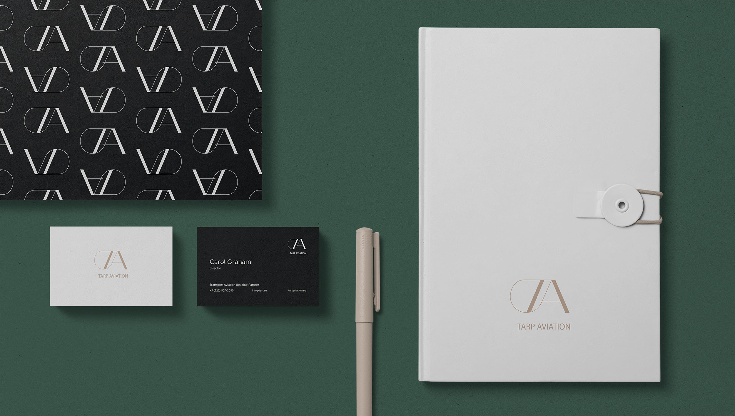
The wide elements at the center of the logo are designed to resemble a runway viewed in perspective. This symbolism represents the beginning and end of each flight, highlighting the punctuality and safety for which private aviation is renowned.