- works
- RSP
RSP
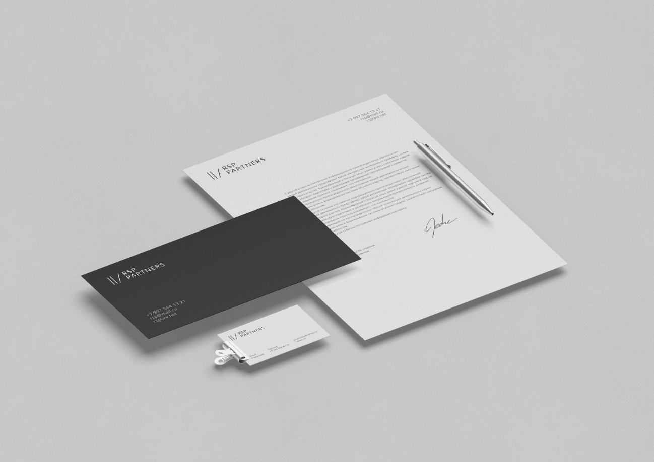
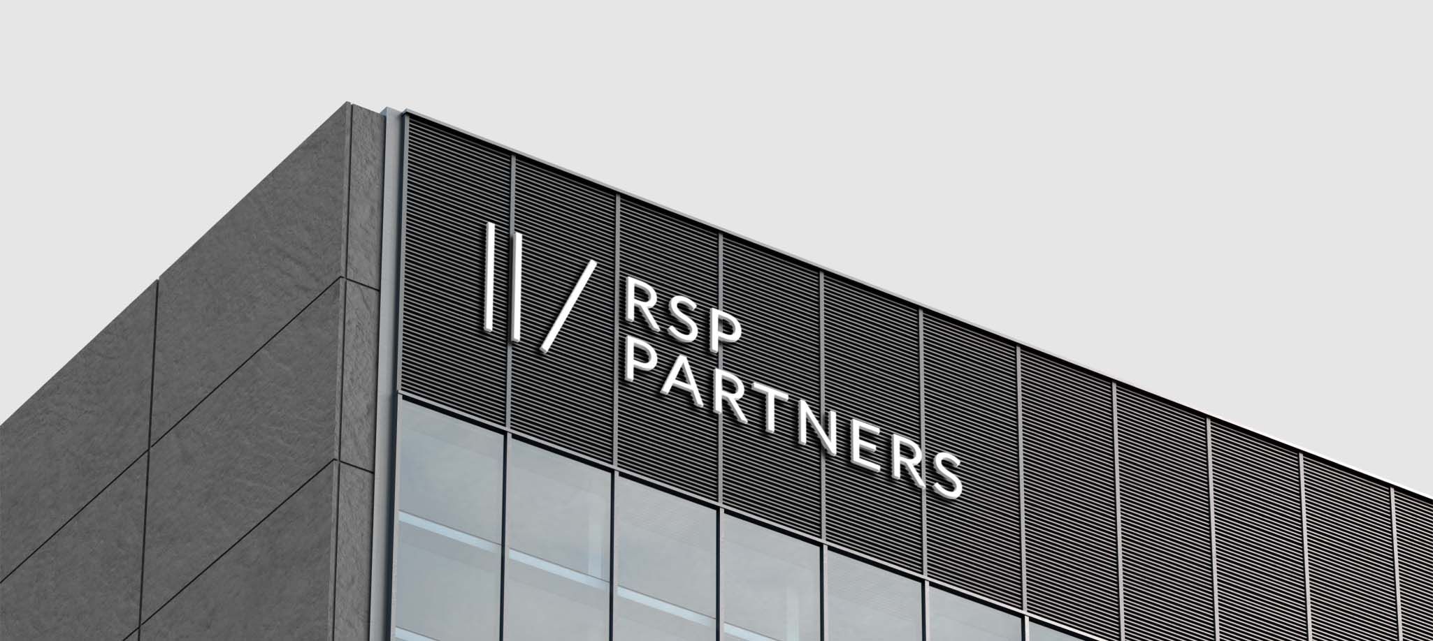
Reliability, solidity and a minimum of unnecessary details — it was with such a task that the RSP Partners law firm came to us. Creating this logo, we were inspired by the style of business printed publications and simple geometric shapes.
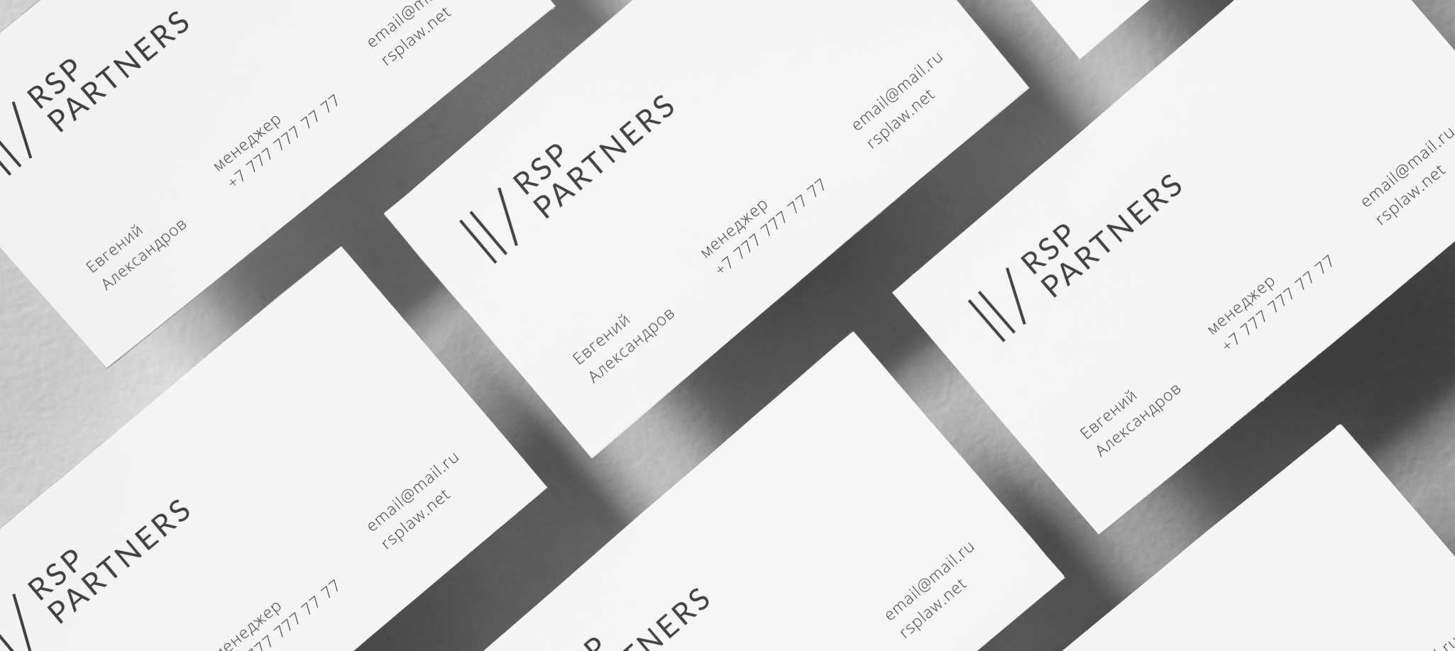
The composition is based on three vertical stripes, one of which "rests" on the inscription RSP Partners. The stripes symbolize folders with legal cases, and the slanted line based on the text speaks of the reliability of the company that you can rely on.


They do not look at minimalism, the logo looks holistic and self-sufficient on any media. Its fine lines and precise intervals create the effect of perfect order and clarity.

In addition to the logo, we have developed a unified corporate identity for the company. Strict and concise, but creating a sense of perfect precision and accurate calculation.