- works
- PannaPanini
PannaPanini
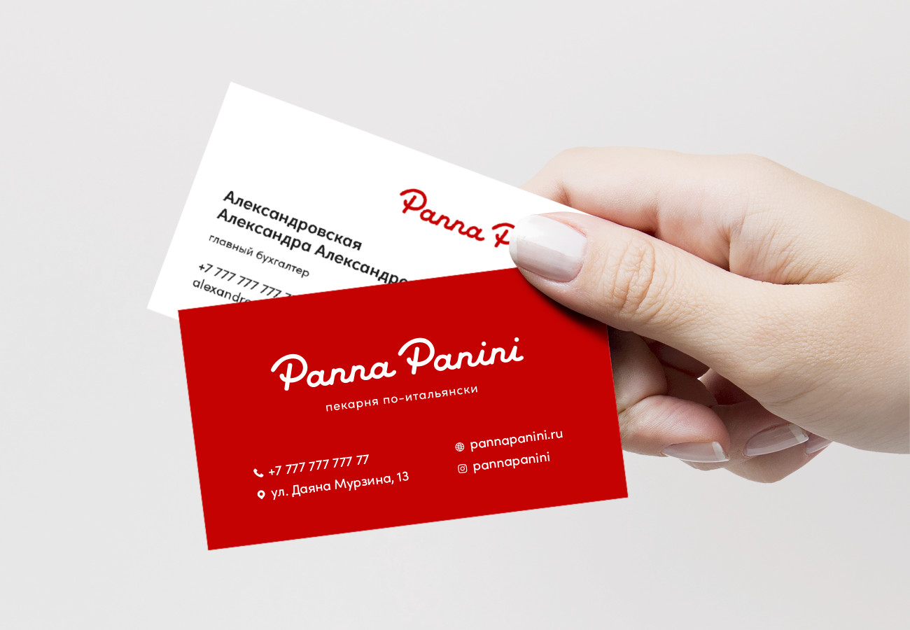
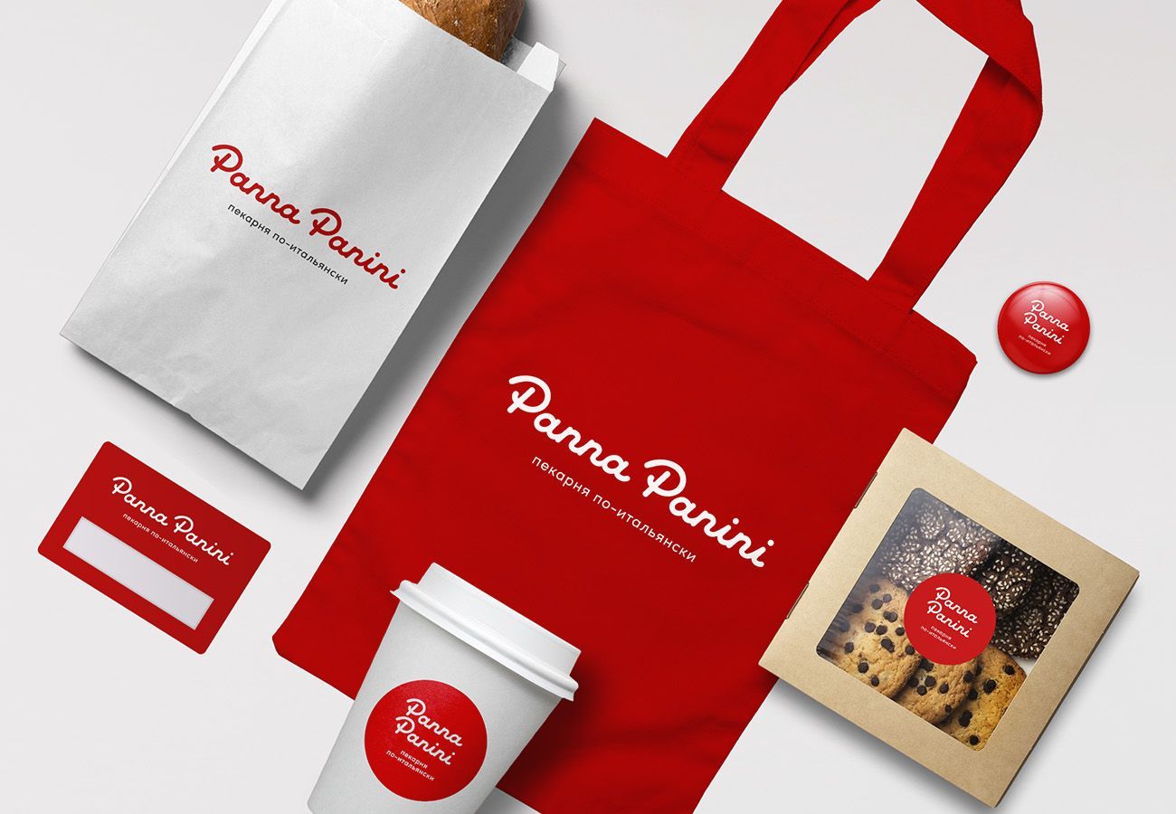
One of the main tasks of branding is to make the product recognizable, and one of the best ways to solve this problem is to break patterns and traditions. Developing the logo and corporate identity for the bakery Panna Panini, we decided to move away from the classic bakery colors and focus on simplicity and bright color. The Panna Panini logo is inspired by Italian classics – Ferrari cars and the best works of pininfarina designers.
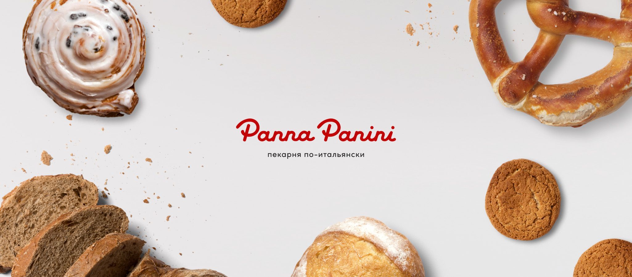
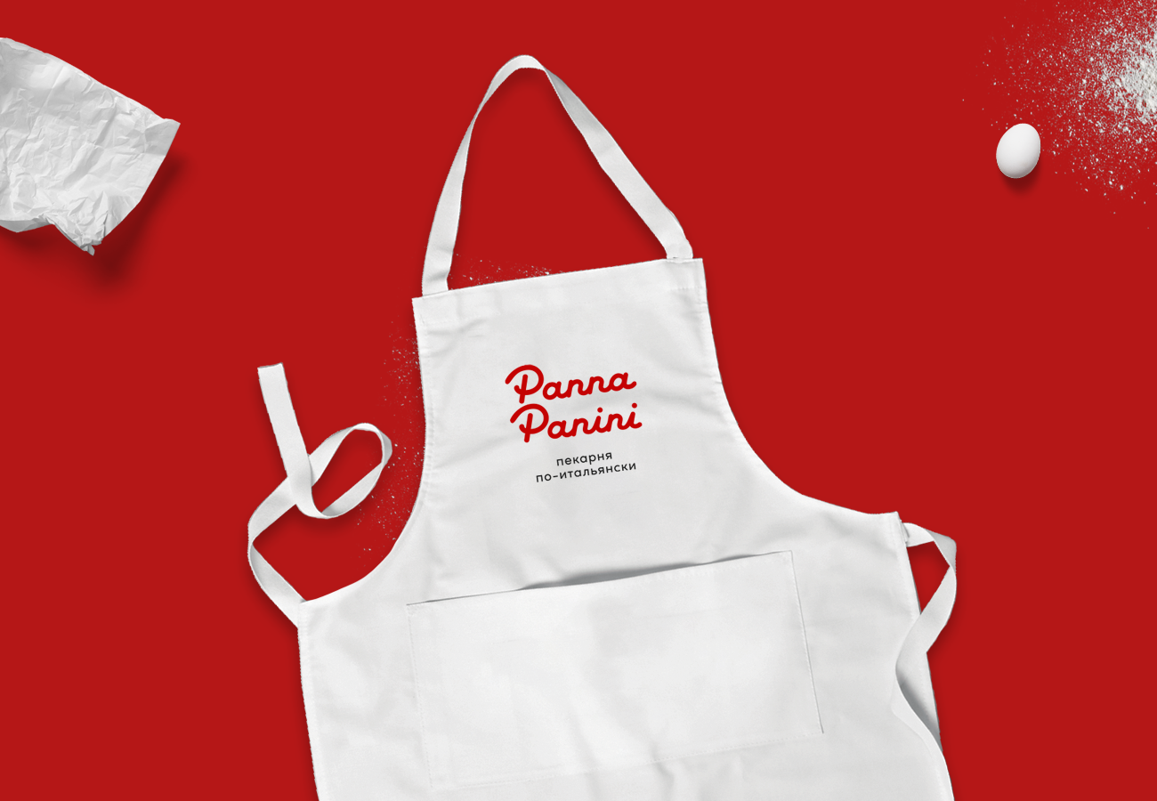
The design is based on a rich red color and the inscription Panna Panini, made in classic Italian style. Simplicity and Italian style.
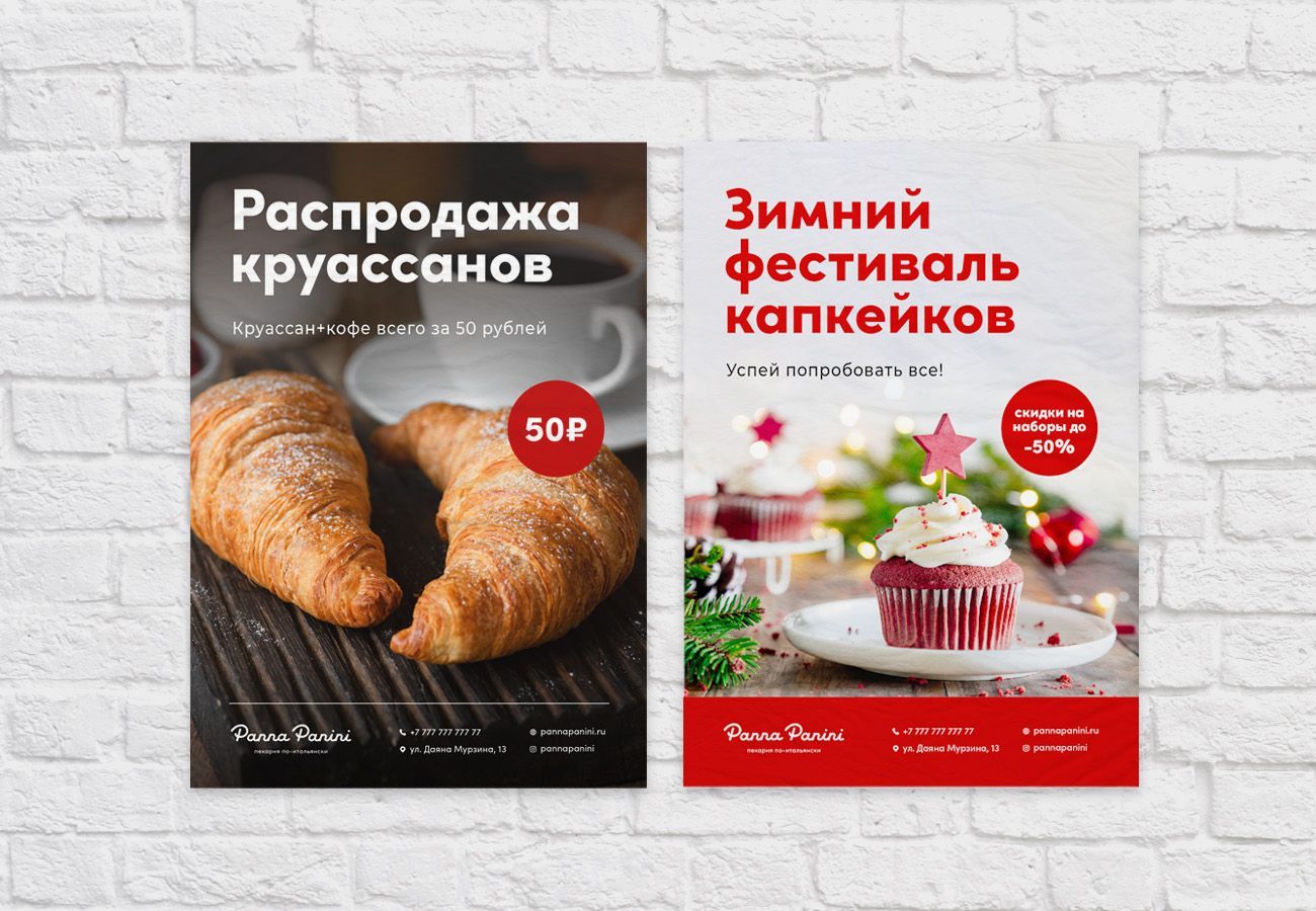
We have developed advertising templates and promotional materials for the design of the exhibition hall and the promotion of a new brand.
The design of the bakery stands out perfectly against the background of traditional "baking" styles.